
In a set of articles I try to give an introductory look at the major unemployment analysis indicators. Definitions are available here, an explanation on these indicators popularity here, and some examples on the practical use here. This piece further explores the nature of the link between initial claims and unemployment.
The problem
The previous basic analysis revealed that there is a strong statistical link between claims and unemployment. However, the connection suffers from several issues. Most notably, the 2020s data behaved as outliers and the scatter plot showed visible heteroscedasticity along the general regression line. Without applying more advanced statistical methods, here I will try to look into the nature of the claims vs. unemployment link by distinguishing between the various decades' data.
Initial claims analysis
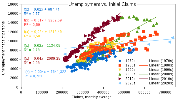
The first chart plots unemployment against initial claims. Color and dot shape differentiate between the decades. Several observations seem evident:
- the link is strong for most decades except the 1980s and 1990s;
- the power of connection (the regression line slope) mostly varies in the 0,01-0,04 interval with the 2020s being the exception and the regression line turning more horizontal;
- the variability of unemployment differs across decades with the 1970s having the lowest amplitude and the 2000s and 2010s the highest.
Continued claims
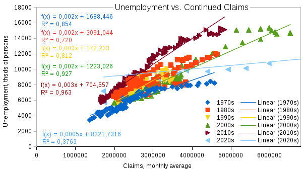
The second chart shows unemployment plotted against continued claims. The conclusions are basically the same as in the previous case. The only major difference seems to be the level of auto correlation the continued claims data have.
Possible reasons
So what can explain the time-varying nature of the connection between unemployment and claims? And what has been happening in the 2020s - is the link disappearing? Several considerations appear to be pertinent:
• the fine-tuning of the claims mechanism has been growing over the decades after the disorderly behavior in the 1980s and 1990s, and it is working in terms of both workers being completely accustomed to the application procedure and statistical tools used to gather and process data;
a higher share of the workforce seems to be working in the official economy nowadays than in the past thus greatly simplifying meeting the benefits eligibility criteria;
• the highest variability along the regression lines is usually seen in the times of economic uncertainty (most notable cases being years 1980, 1993, and 2009) when workers are unsure of the current and near-future trends in the economy, and it does not matter whether the prospects are good or bad - it is the lack of understanding if you need to file this claim or not that makes the connection so brittle;
• the 2020-21 data is obviously influenced by the COVID-19 pandemic with major notes being threefold:
– as the US Bureau of Labor Statistics (BLS) explains (see here), some of the workers who were temporarily unemployed due to the pandemic were misclassified as "absent from work";
– should have these workers been classified correctly the number of the unemployed would have been significantly higher thus turning the 2020s regression line to a more vertical position (in other words, the line would have had a steeper slope) which is more resembling the lines of the previous decades;
– the scale of the misclassification is uncertain with BLS publishing estimates, some of which imply that unemployment figures could have been 0.7-0.8 mln higher than the official record.
Conclusion
All in all, the connection patterns between claims and unemployment have been varying over time. Nevertheless, the link stays strong and has even grown in recent decades. The 2020-21 data is highly likely to have some temporarily unemployed workers incorrectly specified, and the nexus characteristics will most probably return back to a more normal appearance after the pandemic situation returns back to normal.